


Brand Architecture, @sydneymarie.co
-
Destination Wedding Photographer, Author, and Entrepreneur, Sydney Marie rebranded with Belletwine Press for 2022. Celebrating 7 years in business, Sydney wanted a lush, sustainable brand architecture that can stand the test of time.
The sans-serif typefaces and tailored, clean lines are an ode to the centurion fashion brands that have defined generations of style. This, paired with he future-minded aesthetic that the Sydney Marie brand pioneers through her work, allows a feminine yet bold pattern to emerge. Her tangible and digital collaterals focus her passion for film photography with the contemporary impressionism and movement she’s established in her seventh year.
Launch Date: December 30, 2021
-
Client: sydneymarie.co
Complete Brand Architecture, Narrative & Messaging Guidelines, Client Care and Point-Of-Sale Design, Squarespace Website, Brand Box with Paper Collaterals, Brand Marks and Visuals, Iconography, Social Suite, Creative Cloud Library, Copywriting, Creative Consultation and Operations Audit.
-
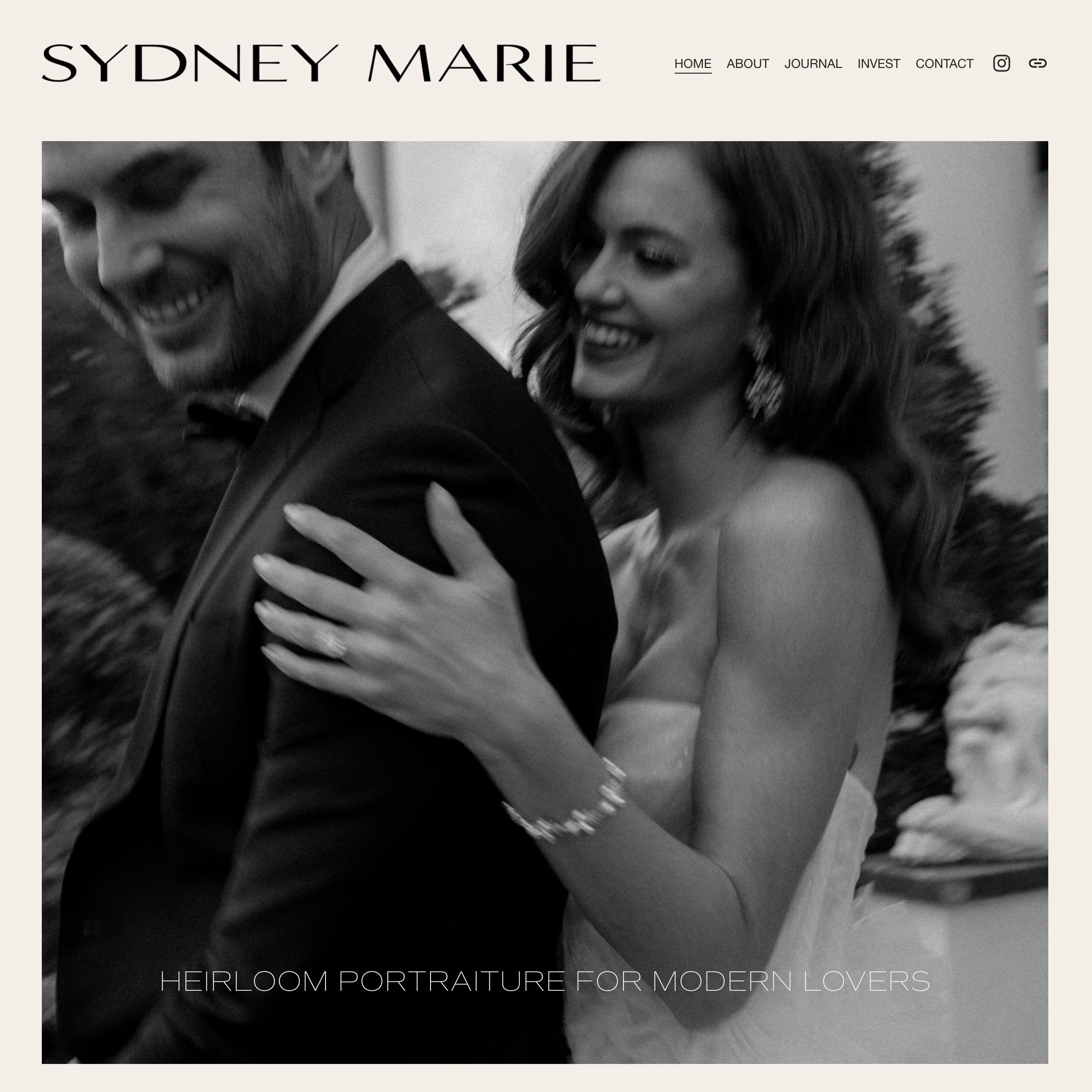

Our favorite rebrand of all time, Sydney Marie Co.
The capstone project of 2021, Belletwine Press completed a magnificent year with devoted client and friend, Sydney Marie Co. This rebrand speaks to our internal heartland of romance and elegance.

-
Our work with Sydney Marie began in February 2020 on Foundry, The Wedding Guide. Over the last two years, we’ve worked closely with her brand and built a clear view of the trajectory her business was taking moving into this new decade. It was our pleasure and honor to deliver a cohesive, unified visuals and voice across her platforms.
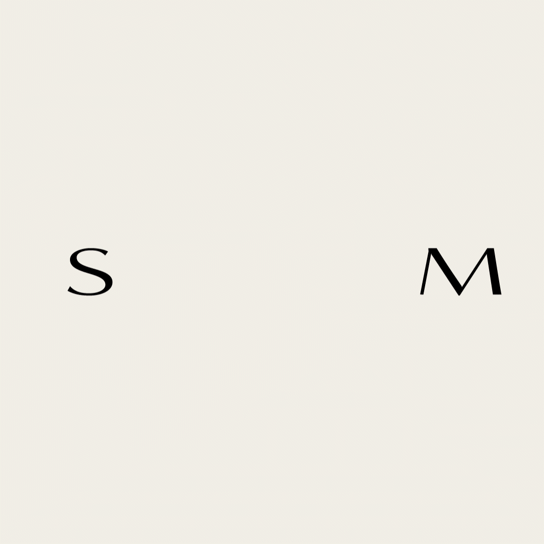
The website design and iconography are standout deliverables for this project. Through her unique treatment of impressionist movement and landscape, SM masters intimate closeness, observer documentation and illusive obstructions of organics— like fabric, foliage, or bodies intertwined with emotion, intention, and commitment; we knew SM’s social suite and web design had to marry the motion and hopeful stoicism of her portraiture. An element of this is her custom loading animation, displaying a convergence of her secondary mark, letters S and M.
We honored the traditional, vintage-inspired grit of her film photography through serif typography in print materials. Additionally and most predominately, we featured two primary sans-serif typefaces for digital platforms and everyday media. These marks and guidelines provide a versatile, consistent brand presentation that pairs well alongside the romantic, posh imagery that SM is known for.
Our favorite element has to be the custom embossing and debossing details. These provide texture to the essence and elegance of Sydney’s style, photography, and creative vision. The act of imprinting letterhead adds a touch of old-world luxury with the soul of small business; every service, no matter how inherently intangible, can become impactful through strong stories and brand mythology.
-
photographer & client @sydneymarie.co
